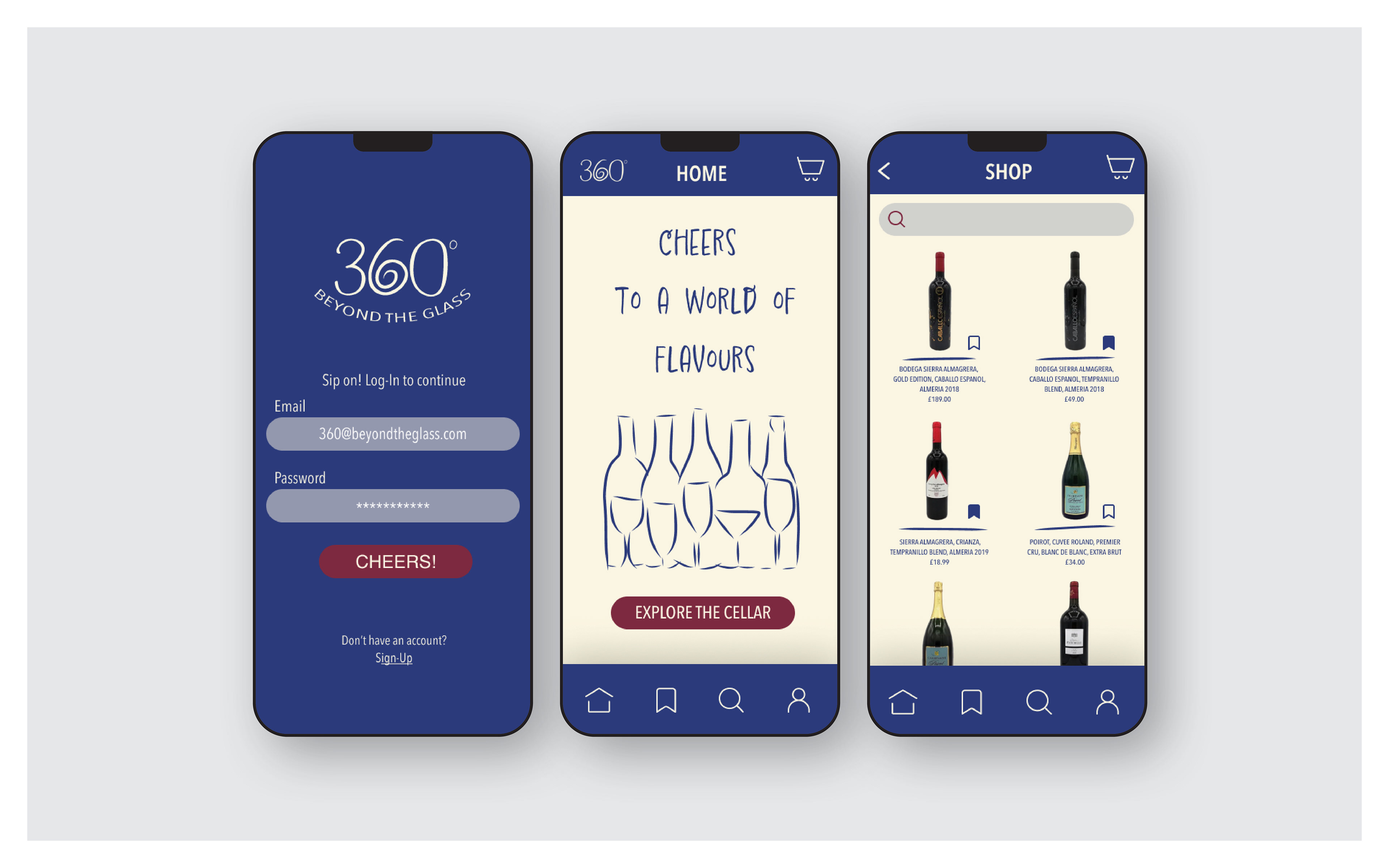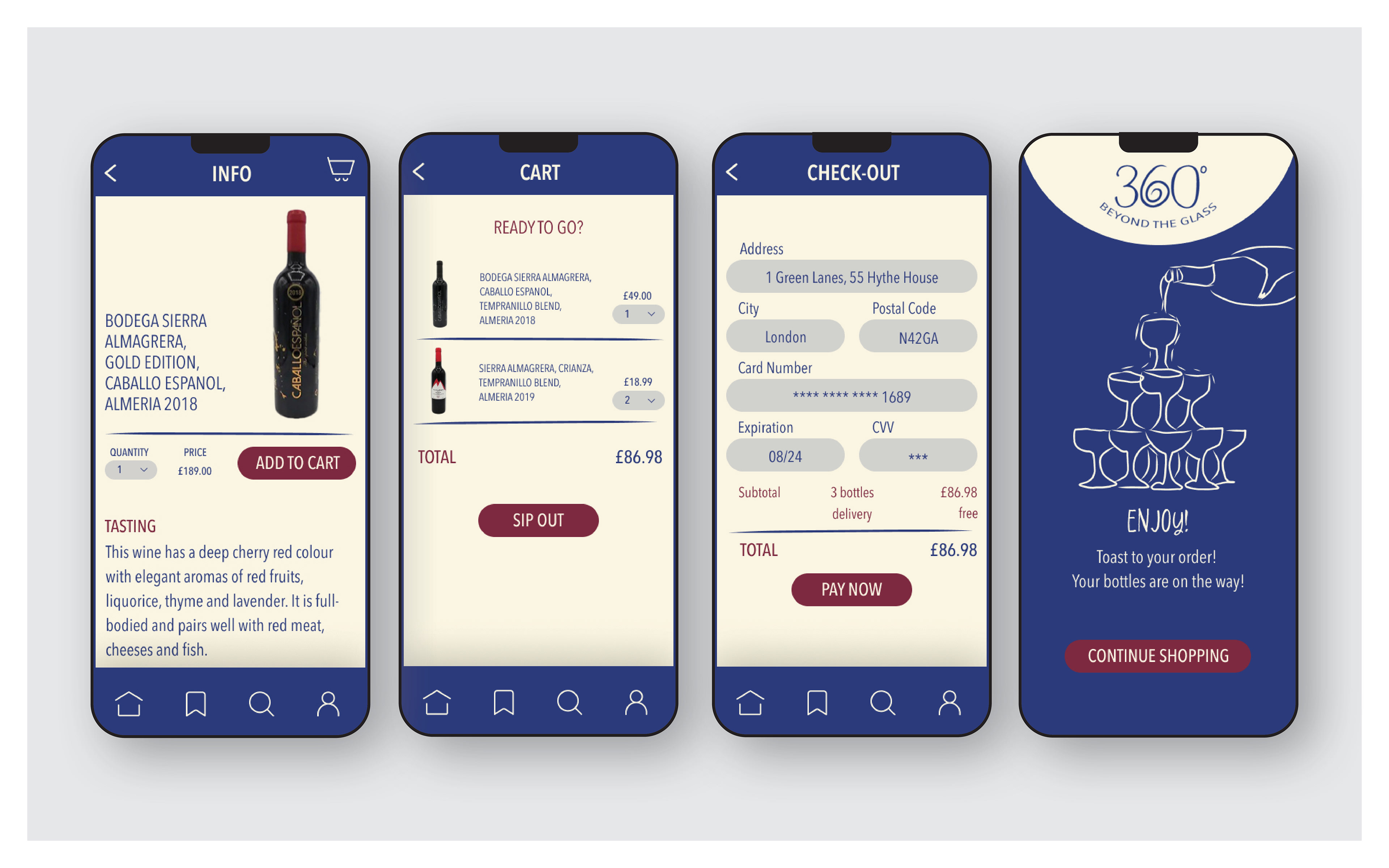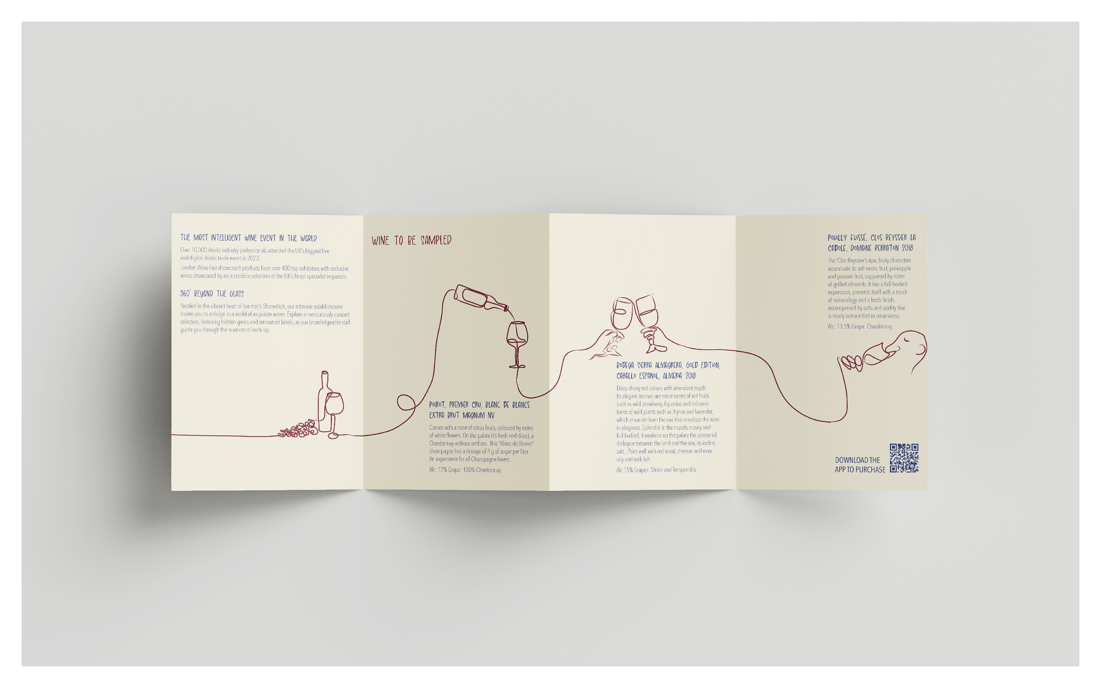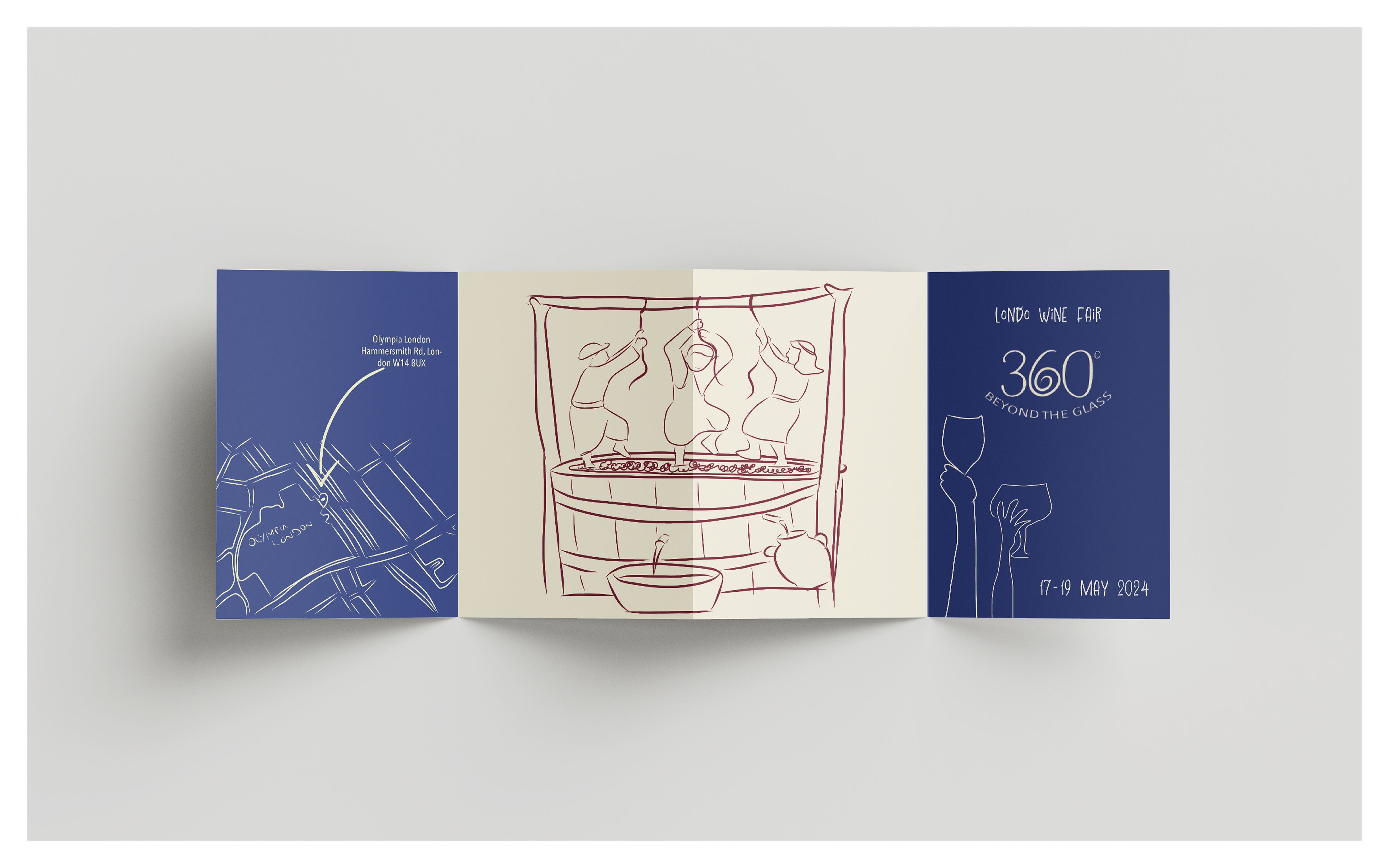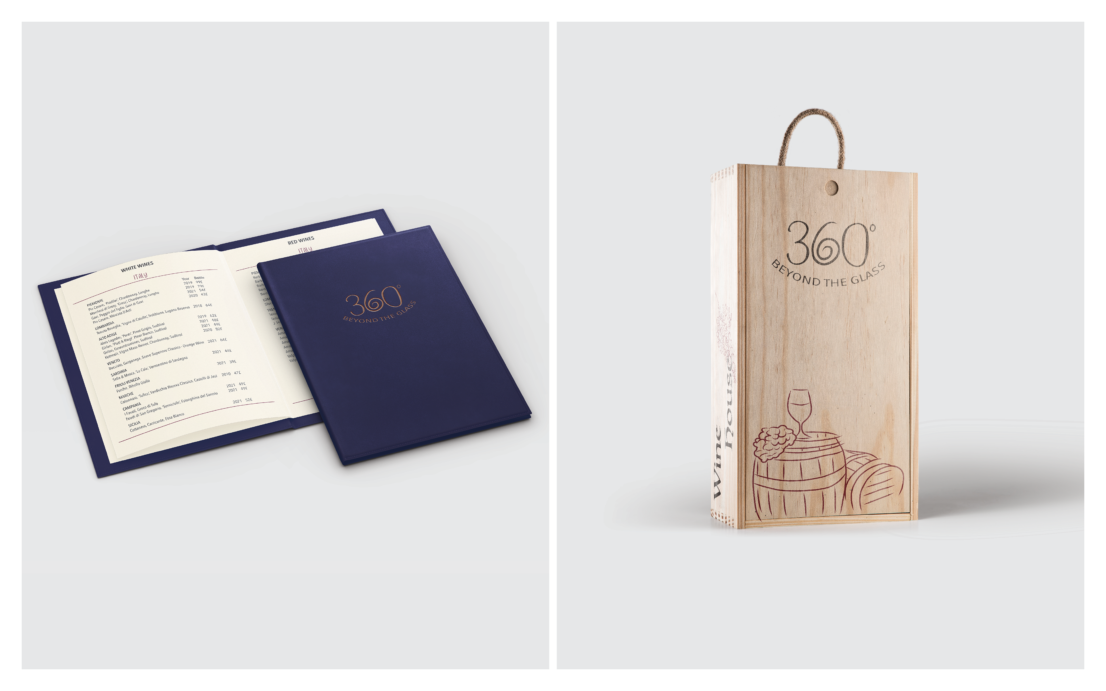


This project involves a comprehensive rebrand for Shoredich Wine House, aiming to modernize its visual identity and communication style while aligning with its audience, values, and subject. I introduced a new colour palette that reflects the essence of wine, with blue representing grapes, red symbolizing wine, and off-white adding contrast. The brand’s tone of voice is now more familiar, matching its values, while with my illustrations I wanted to enhance friendliness and appeal. I emphasized the importance of the mobile app for the delivery services that they offer, introduced a brochure for new wines in-store, created a menu for in-person wine experiences, and designed wooden boxes for wine deliveries.
