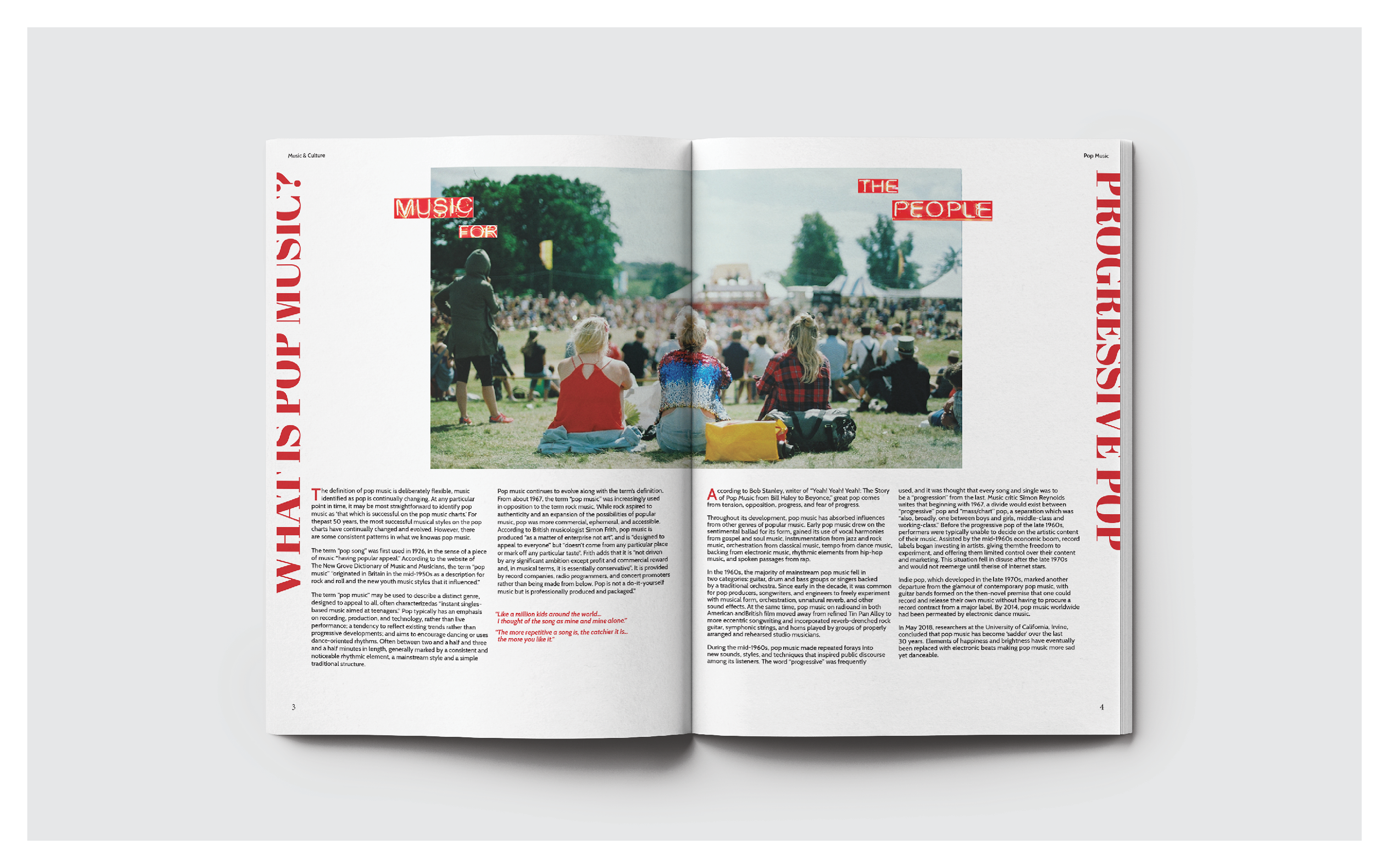

This project aims to create an engaging article layout and magazine cover. I carefully select images that enhance the storytelling and align with the theme. The layout spans 2-3 double-page spreads, prioritizing readability and aesthetics. For the magazine cover, I decided to merge the legendary American singer Billie Holiday and a modern dancer’s imagery, symbolizing a fusion of eras in line with the theme, “Cut Time.” The headline outside the frame grabs attention reinforcing the theme, consistent throughout the article. Dominant use of red infuses energy, capturing the enduring power of music. I crafted the typographic design in the first spread to set the tone of the entire piece. Careful attention is paid to typesetting to ensure readability and aesthetics, creating a harmonious and visually pleasing flow of content.

