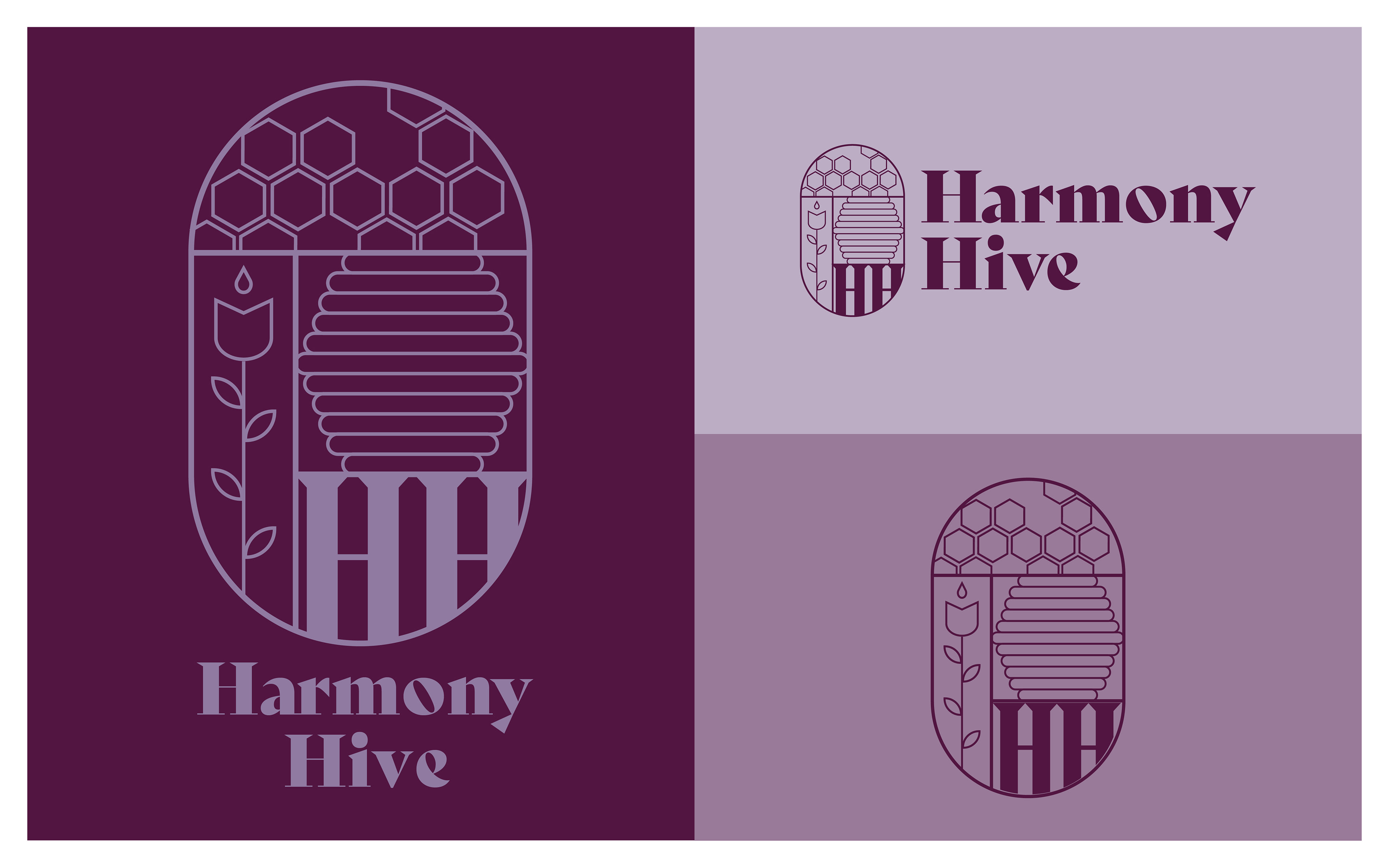


The project involves creating a brand identity for ”Harmony Hive”, an organic honey
company that aims to combine quality, sustainability, and biodiversity.
I chose a color palette inspired by bee-friendly flowers, with purple as the central
shade, as it is the most visible color to bees, representing the brand’s commitment to
bees and nature.
The Art Deco-style logo evokes botanical alchemy, while the minimalist illustrations
reflect the product’s simplicity and natural essence. To strengthen the visual identity,
I designed decorative frames and typographies that combine slab serif titles with
scientific-style text, emphasizing authenticity and precision.
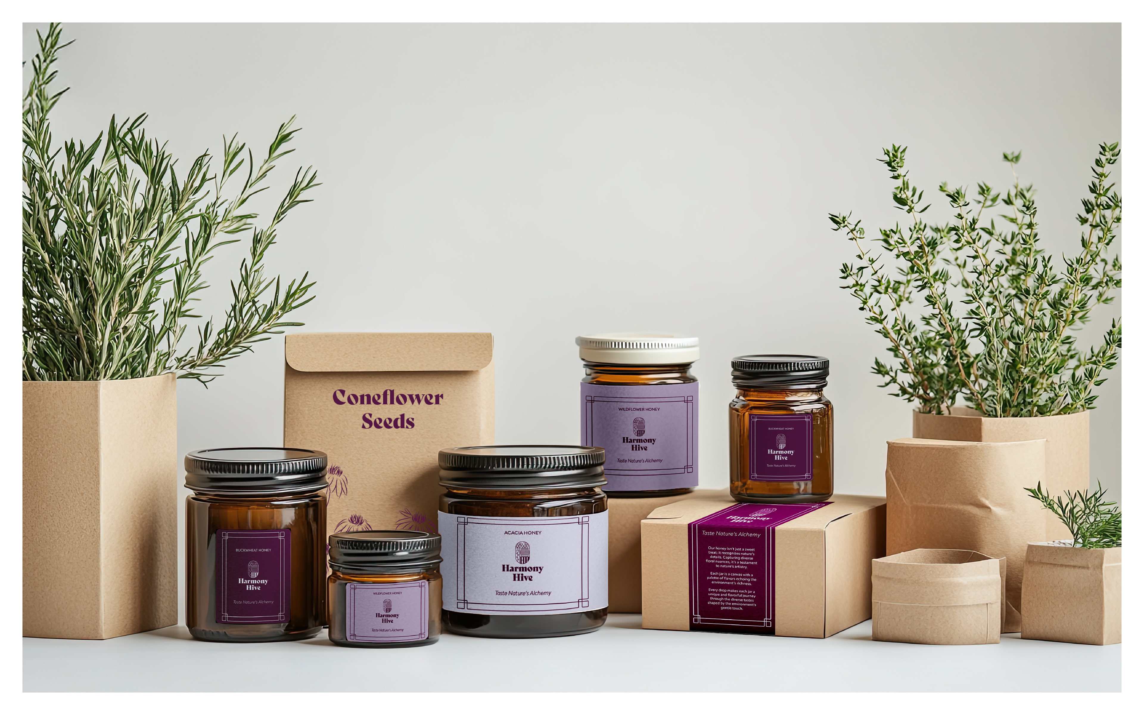
The tone of voice was crafted to communicate with high-end chefs and
restaurateurs, highlighting authenticity and expertise. I also developed an ecosustainable
packaging with labels that tell the unique story of each jar, engaging
customers in a refined and conscious experience.